La Trace: a mobile companion for cycling trips across France
B2C
Web to mobile
Shipped work

Role
Product Designer (freelance)
Team
About 10 people across product and marketing
Timeline
May 2024 to May 2025
Platforms
iOS and Android
Status
Live
TL;DR
La Trace helps people plan bike trips across France. Over a year as its freelance product designer, I took La Trace from a web app to an iOS and Android app: navigation, map, route pages and profile, built on a design system I maintained.
I led most of the 70 or so user interviews. The app is live, with about 10,000 downloads in its first year.
Context
La Trace is a startup for long-distance cyclists: people who love nature, slow travel and exploring France at their own pace.
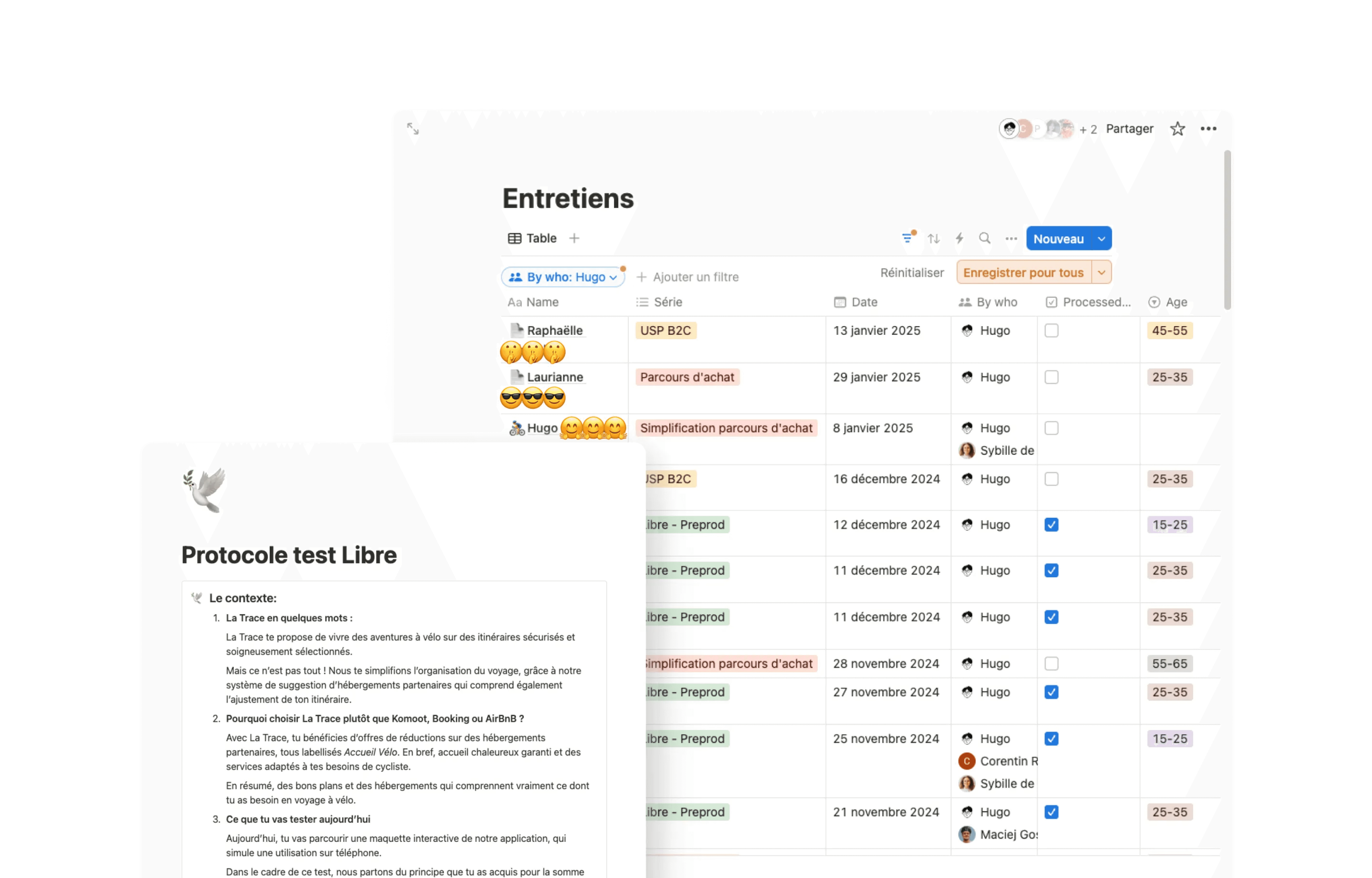
It started as a web app. Interviews with cyclists showed they needed support during the trip itself, not only before it. So we built a mobile app.
My role
I was the only product designer in the last 6 months I was there, in a team of about 10 people across product and marketing, mostly freelancers. I designed the whole mobile app:
Navigation and information architecture
Route detail pages
The profile
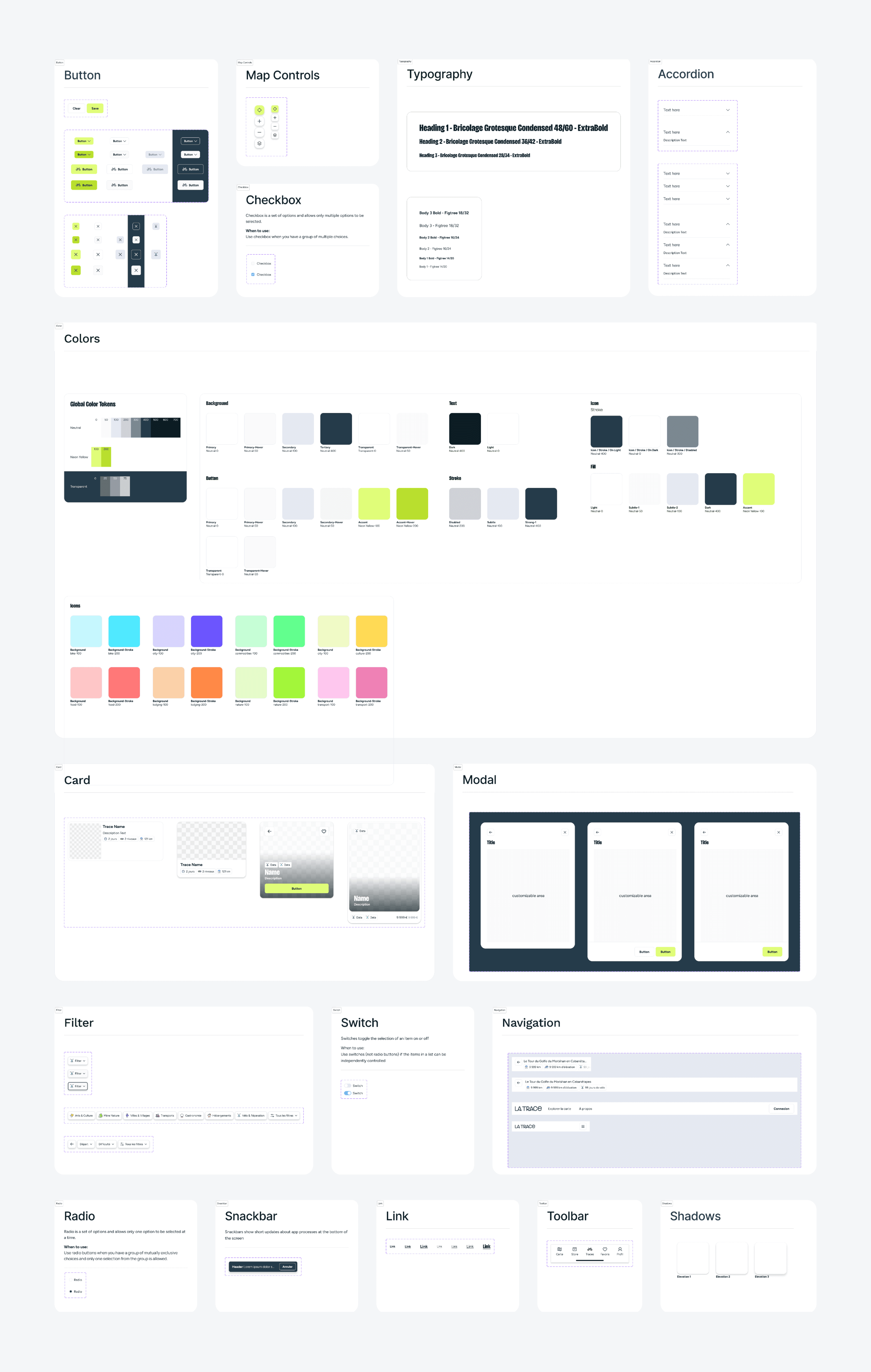
The design system, which I maintained and extended
I also conducted most of the user interviews.
Problem
To plan a bike trip, cyclists juggle many sources: routes, lodging, train stations, places to eat. On the road, it gets harder.
Imagine being out on your bike without knowing where you will sleep tonight. Suddenly, it starts to rain. You open the app, desperate to find bike-friendly lodging, fast.
The web app was not built for that moment. Two questions guided the project:
How might we bring everything a cyclist needs into one place, before and during the trip?
How might we make it readable at a glance, without adding friction?
Key decisions
1. A map you can read at a glance.
Interviews showed the satellite map was hard to read. I moved to an abstract map style, so routes and points of interest stand out. Quick filters, such as train stations, help cyclists find what they need in one tap.

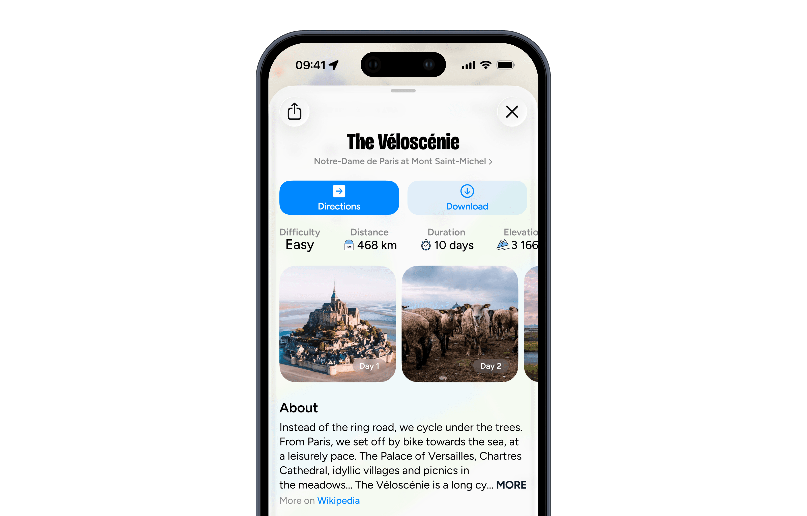
2. Everything about a route on one page.
Directions, download, difficulty, distance, duration and elevation come first. Then the day-by-day stages with photos, and a short description. Cyclists can judge a route in seconds, then dig deeper.
3. Familiar navigation.
The navigation relies on proven iOS and Android patterns, so cyclists feel at home from the first launch and nothing gets in their way.
4. A profile that follows your trips.
Your current position and the trips you have done, in one place.

Explored, not shipped
We also explored a membership, “Le Club”, and a lodging booking flow. Neither was viable for the business, so we did not build them. The app and its content stayed free.